AdvancedWeb Development · Lesson 19 of 19 · Updated ·
CSS Variables, Transitions, Transforms and Animations — With Dark Mode
Two features make modern CSS much nicer to work with. Custom properties (CSS variables) let you define a colour or size once and reuse it everywhere — the basis of themes and dark mode. Transitions and animations add small, smooth movements that make an interface feel responsive. This lesson covers both, plus the performance and accessibility rules that separate good motion from annoying motion.
1. CSS custom properties (variables)
A custom property is a name starting with two dashes. You set it once and read it with var():
:root {
  --brand: #c94f0f;
  --text: #1f2937;
  --bg: #ffffff;
  --radius: 12px;
  --space: 16px;
}

.button {
  background: var(--brand);
  color: white;
  border-radius: var(--radius);
  padding: calc(var(--space) / 2) var(--space);
}

.card {
  background: var(--bg);
  color: var(--text);
  border-radius: var(--radius);
  padding: var(--space);
}
:rootis the<html>element, so variables defined there are available everywhere.- Change
--brandin one place and every button, link and border using it updates. var(--accent, orange)gives a fallback if--accentis not defined.calc()can do maths with variables:calc(var(--space) * 2).
They cascade and inherit
Unlike Sass variables (which are replaced when the CSS is compiled), CSS custom properties are live in the browser. They follow the normal cascade, so you can override them for one part of the page:
.danger-zone { --brand: #dc2626; } /* buttons inside this section turn red */
And JavaScript can change them at run time:
// Browser only
document.documentElement.style.setProperty("--brand", "#2563eb");
2. Building a dark mode
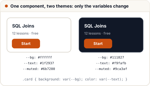
The trick: components only use variables, and themes only change the values.
:root {
  --bg: #ffffff;
  --text: #1f2937;
  --muted: #6b7280;
}

/* Follow the operating-system setting */
@media (prefers-color-scheme: dark) {
  :root {
    --bg: #111827;
    --text: #f9fafb;
    --muted: #9ca3af;
  }
}

/* Or let the user choose with a button that sets <html data-theme="dark"> */
:root[data-theme="dark"] {
  --bg: #111827;
  --text: #f9fafb;
  --muted: #9ca3af;
}

body { background: var(--bg); color: var(--text); }
// Browser only: a theme toggle button that remembers the choice
const btn = document.querySelector("#theme-toggle");
btn.addEventListener("click", () => {
  const next = document.documentElement.dataset.theme === "dark" ? "light" : "dark";
  document.documentElement.dataset.theme = next;
  localStorage.setItem("theme", next);
});
Check text contrast in both themes; light grey text on a dark grey background is a common accessibility failure.
3. Transitions: smooth changes between two states
A transition animates a property when its value changes — for example on :hover or when JavaScript adds a class.
.button {
  background: var(--brand);
  transform: translateY(0);
  transition: background-color 200ms ease, transform 200ms ease;
}

.button:hover {
  background: #a93f08;
  transform: translateY(-2px);
}
The transition shorthand is: property, duration, timing function, optional delay.
| Part | Example | Meaning |
|---|---|---|
| property | transform, opacity, all | what to animate (all is easy but can animate things you did not intend) |
| duration | 200ms, 0.3s | how long |
| timing function | ease, linear, ease-in, ease-out | the speed curve |
| delay | 100ms | wait before starting |
Timing functions (easing)
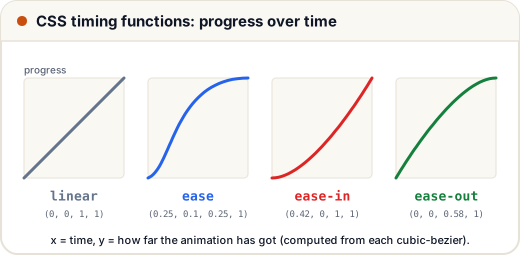
ease-outfeels natural for things entering (a menu sliding in): fast start, gentle stop.ease-insuits things leaving.linearsuits continuous motion such as a spinner.cubic-bezier(…)lets you design your own curve.
Durations: most interface transitions feel right between about 150 ms and 300 ms. Longer ones start to feel slow.
4. Transforms: move, scale and rotate
transform changes how an element is drawn without changing the layout around it:
| Function | Example | Effect |
|---|---|---|
translate(x, y) | translateY(-2px) | move |
scale(n) | scale(1.05) | grow or shrink |
rotate(angle) | rotate(45deg) | rotate |
| combined | translateX(10px) rotate(5deg) | applied in order |
transform-origin sets the point it scales or rotates around (centre by default).
Because transforms do not move other elements, they are perfect for hover effects: a card can lift (translateY(-4px)) without pushing its neighbours.
5. Keyframe animations
Transitions go from A to B when something changes. Animations can have many steps, run on their own, and repeat.
@keyframes pulse {
  0%   { transform: scale(1);    opacity: 1; }
  50%  { transform: scale(1.15); opacity: 0.7; }
  100% { transform: scale(1);    opacity: 1; }
}

.live-badge {
  animation: pulse 1.5s ease-in-out infinite;
}

@keyframes spin {
  to { transform: rotate(360deg); }
}

.spinner {
  width: 32px;
  height: 32px;
  border: 4px solid #e5e7eb;
  border-top-color: var(--brand);
  border-radius: 50%;
  animation: spin 0.8s linear infinite;
}
animation part | Example |
|---|---|
| name | pulse |
| duration | 1.5s |
| timing function | ease-in-out |
| iteration count | 3, infinite |
| direction | normal, alternate (forwards, then backwards) |
| fill mode | forwards keeps the final state after it ends |
The pulsing "LIVE" badge for a live class and the loading spinner above are two of the most common real uses.
6. Performance: animate the cheap properties
When a property changes, the browser may have to redo layout (work out sizes and positions), then paint (draw pixels), then composite (put layers together).
| Property type | Examples | Cost |
|---|---|---|
| layout | width, height, top, left, margin | highest: everything around may move |
| paint | color, background-color, box-shadow | medium |
| composite only | transform, opacity | lowest: often handled by the GPU |
So animate transform: translateX() instead of left, and transform: scale() instead of width. On budget phones, this is the difference between smooth motion and stutter.
7. Respect reduced motion
Some people get dizzy or nauseous from movement on screen. Operating systems have a "reduce motion" setting, and CSS can read it:
@media (prefers-reduced-motion: reduce) {
  *,
  *::before,
  *::after {
    animation-duration: 0.01ms !important;
    animation-iteration-count: 1 !important;
    transition-duration: 0.01ms !important;
    scroll-behavior: auto !important;
  }
}
This is one of the rare places where !important is reasonable: it is a user preference that should win. Also avoid anything that flashes more than three times per second.
Common mistakes
- Forgetting the two dashes (
var(brand)instead ofvar(--brand)). - Hard-coding colours in components, which makes dark mode a rewrite.
transition: all 1severywhere: slow, and it animates unexpected properties.- Animating
width,toporleftinstead oftransform. - Endless decorative animations that distract from the content, and ignoring
prefers-reduced-motion.
Quick recap
--name: valuedefines a custom property;var(--name, fallback)reads it; they cascade and can change at run time.- Dark mode = same components, different variable values (
prefers-color-schemeor adata-themetoggle). transition: property duration easinganimates between two states; keep it around 150–300 ms.transform(translate, scale, rotate) moves things without affecting layout.@keyframes+animationfor multi-step or repeating motion.- Animate
transformandopacity; respectprefers-reduced-motion.