Web Development · Lesson 5 of 12 · Updated ·
CSS Layout — Flexbox and Grid Made Simple
Layout means placing boxes on the page: navbars, card rows, sidebars. Modern CSS has two tools that handle almost everything: Flexbox and Grid.
1. Flexbox: one direction at a time
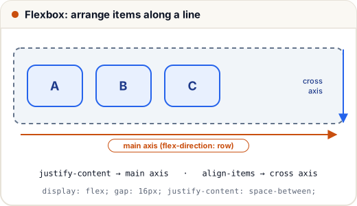
.navbar {
  display: flex;
  justify-content: space-between;  /* main axis: spread out */
  align-items: center;             /* cross axis: vertically centred */
  gap: 16px;
}
| Property (on the container) | Does |
|---|---|
flex-direction | row (default) or column |
justify-content | main axis: flex-start, center, space-between, space-around |
align-items | cross axis: stretch (default), center, flex-start |
flex-wrap: wrap | let items move to the next line |
gap | space between items |
On the items: flex: 1 makes an item grow to fill the space; flex: 0 0 200px fixes it at 200px.
The famous "centre a div"
.center {
  display: flex;
  justify-content: center;
  align-items: center;
  min-height: 100vh;
}
2. Grid: rows and columns together
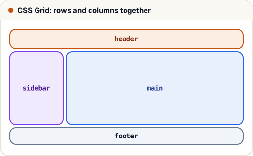
.page {
  display: grid;
  grid-template-columns: 200px 1fr;
  grid-template-rows: auto 1fr auto;
  grid-template-areas:
    "header header"
    "sidebar main"
    "footer footer";
  gap: 12px;
  min-height: 100vh;
}
.page > header  { grid-area: header; }
.page > aside   { grid-area: sidebar; }
.page > main    { grid-area: main; }
.page > footer  { grid-area: footer; }
fr= a fraction of the free space (1fr 2fr→ one third / two thirds).repeat(3, 1fr)= three equal columns.
A responsive card grid in one line
.cards {
  display: grid;
  grid-template-columns: repeat(auto-fill, minmax(220px, 1fr));
  gap: 16px;
}
Cards are at least 220px wide, and as many fit per row as the screen allows — no media queries needed.
3. Flexbox or Grid?
| Use Flexbox for | Use Grid for |
|---|---|
| one row or one column | rows and columns |
| navbars, button groups, centring | page layouts, card galleries, dashboards |
| content decides the size | the layout decides the size |
They work together: a Grid page layout with Flexbox inside each card.
4. position (for special cases)
| Value | Behaviour |
|---|---|
static | normal flow (default) |
relative | nudged from its normal place; becomes the reference for absolute children |
absolute | placed relative to the nearest positioned ancestor; removed from the flow |
fixed | stuck to the screen (a floating WhatsApp button) |
sticky | normal until you scroll past, then sticks (sticky headers) |
Common mistakes
- Using
position: absolutefor whole layouts — it breaks on other screen sizes. - Applying flex properties to the items instead of the container (or vice versa).
- Forgetting
flex-wrap: wrap, so items squash on small screens.
Quick recap
- Flexbox: one axis; justify-content (main), align-items (cross), gap, wrap.
- Grid: rows and columns; fr units, repeat, minmax, template areas.
- Flex for components, Grid for page structure.
- position: relative/absolute/fixed/sticky for special cases.