Web Development · Lesson 6 of 12 · Updated ·
Responsive Web Design — Mobile First, Media Queries and Fluid Layouts
In India, most users browse on phones — often budget Android phones on 4G. A site that only looks good on a laptop loses most of its visitors. Responsive design means one website that adapts to every screen.
1. Step zero: the viewport meta tag
<meta name="viewport" content="width=device-width, initial-scale=1">
Without it, phones pretend to be 980px wide and shrink your page — everything looks tiny.
2. Mobile first
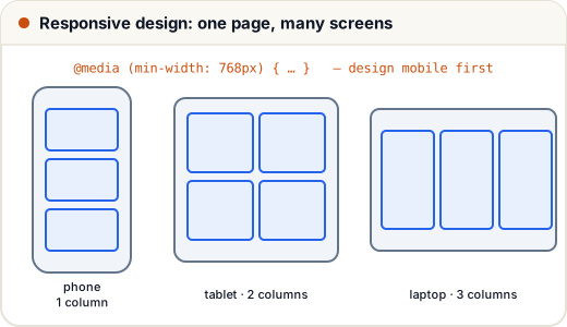
Write the CSS for small screens first, then add rules for larger screens with min-width media queries:
/* Phones (default): one column */
.courses { display: grid; gap: 12px; grid-template-columns: 1fr; }

/* Tablets and up */
@media (min-width: 768px) {
  .courses { grid-template-columns: repeat(2, 1fr); }
}

/* Laptops and up */
@media (min-width: 1024px) {
  .courses { grid-template-columns: repeat(3, 1fr); }
}
Why mobile first? Phones get the simplest CSS (fast on slow devices), and you add complexity only where there's room.
Common breakpoints
| Name | Min width |
|---|---|
| small phones | default (no query) |
| large phones | 480px |
| tablets | 768px |
| laptops | 1024px |
| desktops | 1280px |
Choose breakpoints where your layout breaks, not for specific devices.
3. Fluid everything
img, video { max-width: 100%; height: auto; }   /* never overflow */

.container {
  width: min(100% - 32px, 1100px);   /* full width with 16px sides, max 1100px */
  margin-inline: auto;
}

h1 { font-size: clamp(1.75rem, 4vw + 1rem, 3rem); }   /* grows with the screen, within limits */
max-width: 100%stops images breaking the layout.min(),max(),clamp()give fluid sizes without many media queries.
4. Touch-friendly design
- Tap targets at least 44 × 44px with space between them.
- Readable text: at least 16px body font on phones.
- No horizontal scrolling — test at 360px width (a common Android size).
- Don't rely on hover; phones have no hover.
5. Performance is part of responsive
- Compress images; use modern formats (WebP, AVIF) and
loading="lazy". - Ship less JavaScript.
- Test on slow 4G in DevTools (Network tab → throttling).
6. Testing
- Chrome DevTools → device toolbar (Ctrl + Shift + M) → try 360px, 768px, 1280px.
- Open the site on your own phone (same Wi-Fi: use your laptop's local IP address).
- Run Lighthouse for performance, accessibility and best practices.
Common mistakes
- Forgetting the viewport meta tag.
- Fixed widths like
width: 1200px→ horizontal scroll on phones. - Desktop-first CSS with many overrides for mobile.
Quick recap
- Viewport meta tag first.
- Mobile-first CSS +
min-widthmedia queries. - Fluid images (
max-width: 100%), fluid widths (min()), fluid type (clamp()). - Big tap targets, 16px text, no horizontal scroll, test at 360px.