# CSS Basics — Selectors, Colours, Units, Box Model and Specificity
Source: https://skills101.in/learn/web-development/css-basics — Skills101 free tutorial (Web Development). Updated 2026-11-09.
**CSS** (Cascading Style Sheets) controls how HTML **looks**: colours, fonts, spacing and layout.
## 1. Adding CSS
```html
Hello
```
A CSS rule = **selector** + **declarations**:
```css
h1 {
color: #c94f0f;
font-size: 2rem;
margin-bottom: 16px;
}
```
## 2. Selectors
| Selector | Matches | Example |
|---|---|---|
| element | all of that tag | `p { }` |
| `.class` | elements with that class | `.btn { }` |
| `#id` | the one element with that id | `#hero { }` |
| descendant | inside another | `nav a { }` |
| child | direct child | `ul > li { }` |
| group | several selectors | `h1, h2 { }` |
| pseudo-class | a state | `a:hover`, `input:focus`, `li:first-child` |
| attribute | by attribute | `input[type="email"]` |
> Style with **classes** most of the time. They're reusable and keep specificity low.
## 3. Colours and units
- Colours: `red`, `#c94f0f` (hex), `rgb(201 79 15)`, `rgb(0 0 0 / 50%)` (transparent).
- Units:
| Unit | Relative to | Use for |
|---|---|---|
| `px` | fixed | borders, small details |
| `rem` | root font size (usually 16px) | font sizes, spacing (respects user settings) |
| `em` | the element's font size | spacing inside components |
| `%` | the parent | widths |
| `vw` / `vh` | the viewport | full-screen sections |
## 4. The box model
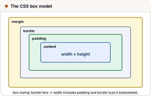
Every element is a box:
- **content** — the text or image
- **padding** — space **inside** the border (takes the background colour)
- **border** — the line around it
- **margin** — space **outside**, between boxes (transparent)
```css
*, *::before, *::after { box-sizing: border-box; }
.card {
width: 300px;
padding: 16px;
border: 1px solid #ddd;
margin: 12px auto; /* auto left/right margins centre a block */
border-radius: 12px;
}
```
With `box-sizing: border-box`, the 300px **includes** padding and border — much easier to reason about. Almost every modern site sets it globally.
## 5. The cascade and specificity
When two rules target the same element, which wins?
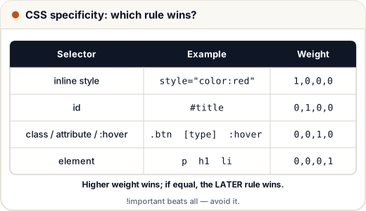
1. **Importance** (`!important` — avoid it).
2. **Specificity** — id > class > element.
3. **Order** — if equal, the rule written **later** wins.
```css
p { color: black; } /* 0,0,0,1 */
.note { color: blue; } /* 0,0,1,0 ← wins over p */
#tip { color: green; } /* 0,1,0,0 ← wins over .note */
```
Some properties (like `color` and `font-family`) are **inherited** by children; others (like `border`, `margin`) are not.
## 6. Typography essentials
```css
body {
font-family: system-ui, sans-serif;
font-size: 1rem;
line-height: 1.6;
color: #1f2937;
}
```
A comfortable `line-height` (1.5–1.7) and a limited line length (about 60–75 characters) make text much easier to read.
## Common mistakes
- Fighting specificity with `!important` instead of using a clearer class.
- Confusing margin (outside) with padding (inside).
- Forgetting `box-sizing: border-box`, so widths come out bigger than expected.
## Quick recap
- Use an external stylesheet; selector + declarations.
- Prefer classes; know descendant, child, pseudo-class selectors.
- rem for type and spacing; % and vw for widths.
- Box model: content, padding, border, margin; use border-box.
- Conflicts: importance → specificity → order.
Practice quiz and free certificate: https://skills101.in/learn/web-development/css-basics